HB Markets
We are delighted with our new brand identity and website. We know that it’s soundly based; Clarity has guided us through the process from research and consultation through to values, architecture, names and designs. Now we are onto our next big challenge – making the most of our strong brand and the seismic shift towards digital marketing. Again we are being led by the team at *Clarity who combine creative and cutting edge skills with a practical can-do attitude that gets results with the minimum pain!
Stephen Greenwood, Chief Executive, Hoodless Brennan Stockbrokers
Investing in a Rebrand for Growth
A successful city based stockbrokers, Hoodless Brennan, had their own ambitious plans for growth. But first they sought a comprehensive and objective evaluation of their brand to ensure their business was maximising its value to the owners as well as its clients .
We undertook a 360 degree review including research amongst clients and referrers as well as the HB team .
Improvements to their service and communications preceded the launch of their new identity.
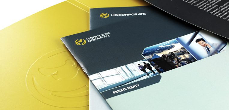
The out-dated and indistinct navy blue logos where replaced with a fresh and distinctive gold branding which echoes the wealth which the brokers seek to provide to their own clients.
The identity we created with our branding partners, Simplify, has its roots in Greek Mythology and depicts Ploutos, the rustic God of agricultural wealth.
An extensive roll out programme conveyed the new branding alongside service improvements resulting from the research feedback.
The investment in communications more than paid for its self with increased awareness of the firm’s range of services and competitive advantages resulting in additional commissions and cross-sales.


HQIP
It is a pleasure to work with *Clarity. They can always be relied upon for objective advice, intelligent analysis and thought provoking ideas as well as practical help to get things done.
James Thornton, Communications Manager, HQIP
Improving Communications and Quality in Healthcare
The Healthcare Quality Improvement Partnership (HQIP) was established in April 2008 to promote quality in healthcare, and in particular to increase the impact that clinical audit has on healthcare quality.
From its inception, Clarity in Marketing has had the pleasure of playing a part by supporting the organisation to grow.
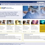
Originally we assisted the team by helping to set up the new organisation through planning, recruitment, branding, website and email marketing.
Next, we have worked with the HQIP team in undertaking a Communications Audit combined with comprehensive stakeholder research. The outcomes of which are feeding into plans for the future which include harnessing the benefits of marketing automation to reach wider audiences with more relevant information, tools and support.

Epigeum
Leading the way in Higher Education
Epigeum is the leading provider of online courses designed to help universities and colleges transform their core activities in teaching, research, studying and leadership and management.
A spin-out from Imperial College, their courses are already being used by over 230 Universities worldwide.
Together with our design partners Kish n Chips, we devised a new brand including tone of voice, copy and content plan.
The resulting website and animation portray the strengths of this innovative organisation and their world-class offering for the higher education sector.


